Product Designer
Spring 2018
Mobile Application
Sketch,Principle
The sales volume of the luxury product market increases year by year with the improvement of economy and consumption level. However, buying luxury products is not always affordable. For this reason, the pre-owned product area is a great solution. There are more and more ways to buy and sell pre-owned luxury products. However, both buyers and sellers have encountered many problems of trust. The top problem with pre-owned luxury products deal is making sure they are authentic. Authentic as the most essential factor of the luxury product has not been guaranteed from the trading platform.
Design Question
How can a customer have the warranty that a pre-owned luxury product has been purchased is actually certified and in good conditions?
Have you purchased or sold luxury products through an App?
Have you purchased any fake luxury products from a private trading platforms?
As a result, the most important feature that user care about of the pre-owned luxury products are quality and authenticity. 72% people never purchased/sold luxury products through an application because they do not believe the quality online, so if MirrorMirror can solve their concern there will be a big market. User need a third party to help them verify the product and provide a trading platform let the buyer and seller communicate directly. MirrorMirror will solve the trust problem and build an application with 100% authentic guarantee.
An affinity diagram is a great method to help me make sense from brainstorming, so I created an affinity diagram to categorizing the features and key points. After the brainstorm, I had an improved idea and direction to design the MirrorMirror. The process helps me figure out what makes a product feel untrustworthy and how to gain a customer's trust and attention by adding more features about the seller's information.
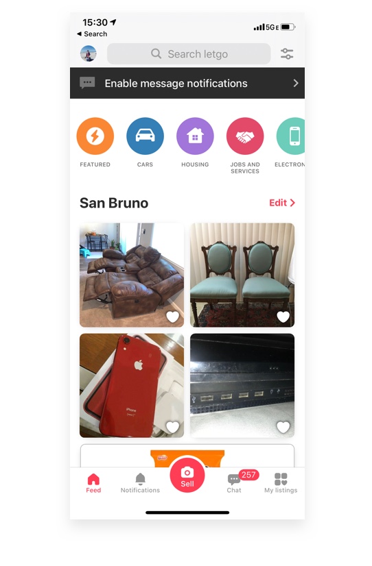
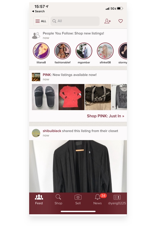
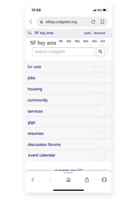
It is always beneficial to highlight strengths and weaknesses from competitor analysis, so I picked three similar applications from the same field and evaluated in different ways.
Functionality
Usability
Simplicity
Functionality
Usability
Simplicity
Functionality
Usability
Simplicity

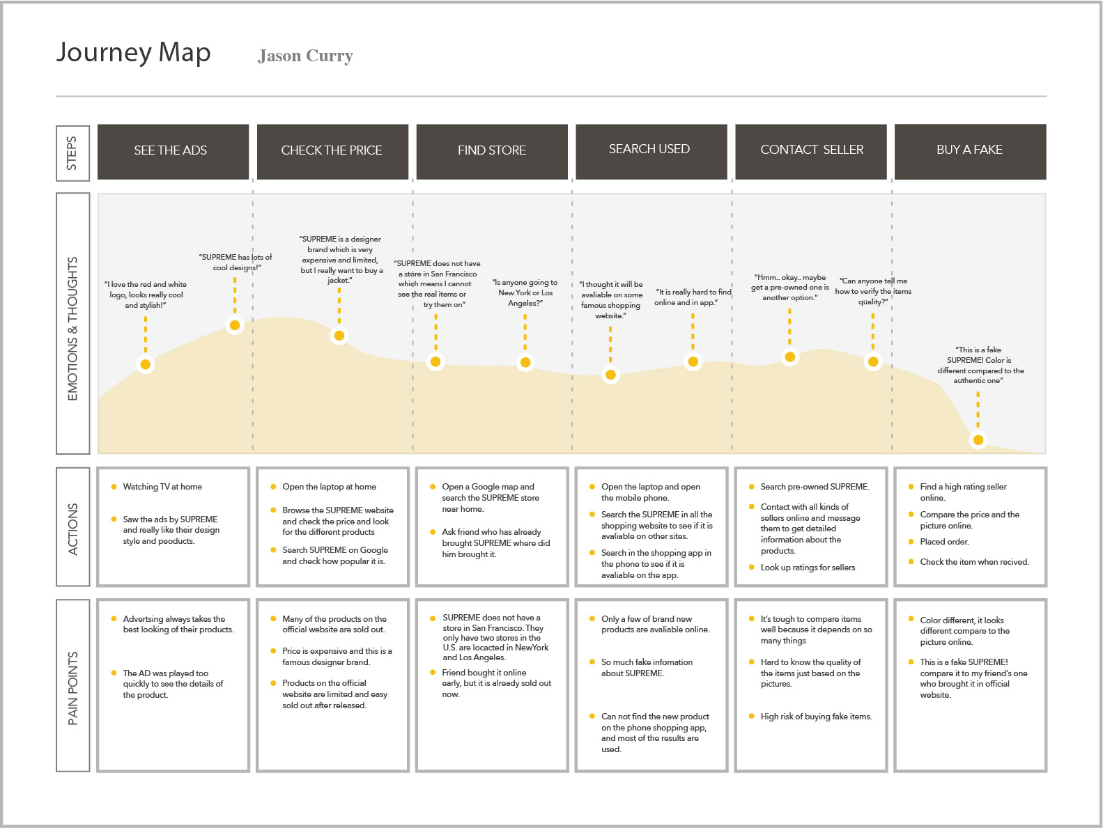
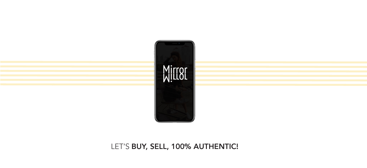
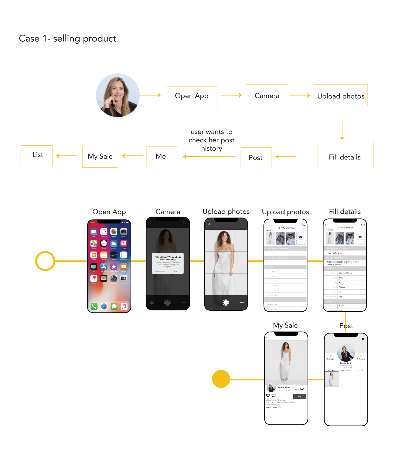
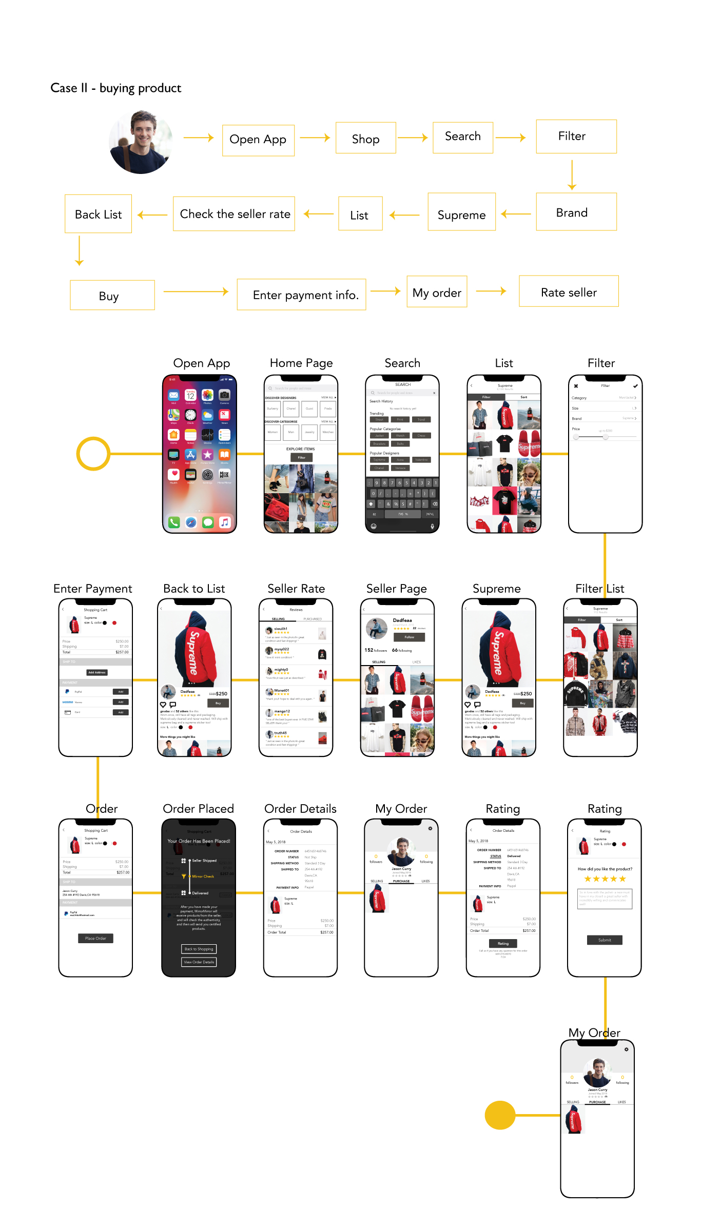
With MirrorMirror application, buyer and seller can communicate directly on this platform and reach a consensus. After buyer have made payment, MirrorMirror will receive products from the seller and will check the authenticity, then the buyer will receive a certified product from MirrorMirror. As the name of this application - MirrorMirror. The user can use this application as their personal magic mirror that will only tell the truth and never lie to the user. Buyers of pre-owned prodtcts can feel safe knowing that they’re getting authentic designer goods at attractive prices.
In order to achieve high user satisfaction, I created some user tasks for my user after I am done with the first version application. I want to use this tasks to follow which parts of my design frustrate people, where they get confused, and what keeps them from converting.
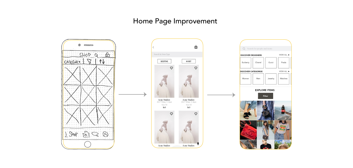
After a few times of user testing, I found users have the most suggestions for the home page. The main function of the homepage is to direct users around my application, they want to have the main features stand out clearly and easy to understand. I divived the home page to four sections: search, categories, filter, suggestions, so the user can easily track one of the sections to start.
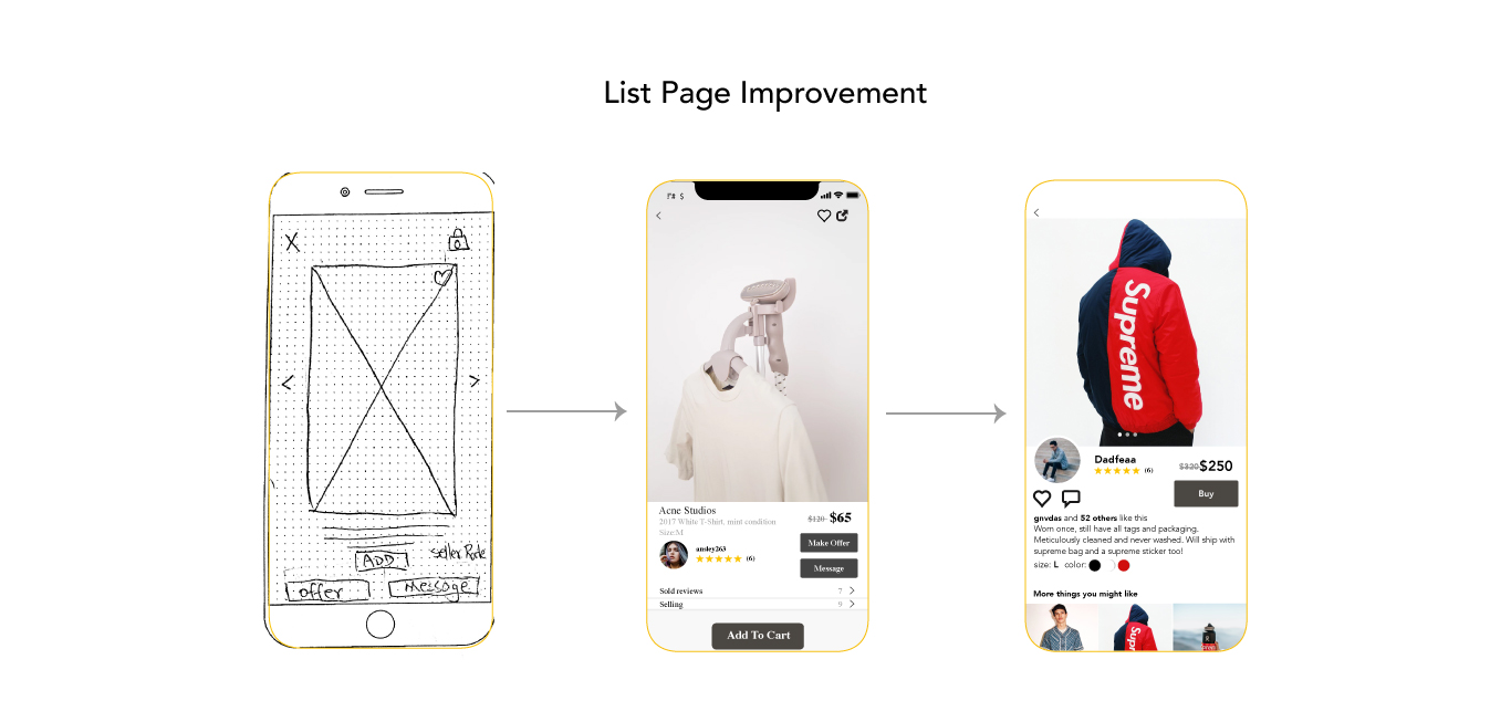
Another improvement is the hierarchy of the listing page is not clear, there are too many buttons on one page which makes my user felt frustration. I simplified to one button and made a clear hierarchy on listing page.
Drop a message at
yangsunwnm@gmail.com
let's chat!
COPYRIGHT © 2019 YANG-SUNDESIGN.COM
DESIGNED & CODED BY YANG SUN

 Click here to view the poject "MirrorMirror" in InVisionApp